Top 5 Stunningly Elegant GNU/Linux Distributions

Top 5 Stunningly Elegant GNU/Linux Distributions
Key Takeaways
- Garuda Linux embraces cyberpunk aesthetics with neon colors and lively animations, giving off a distinct gamer vibe.
- Deepin Linux offers a classy design with a modern, glassy interface that is suitable for both professional and personal use.
- Zorin OS provides a sleek and professional Windows-like experience with flexibility in layout styles and minimalistic design touches.
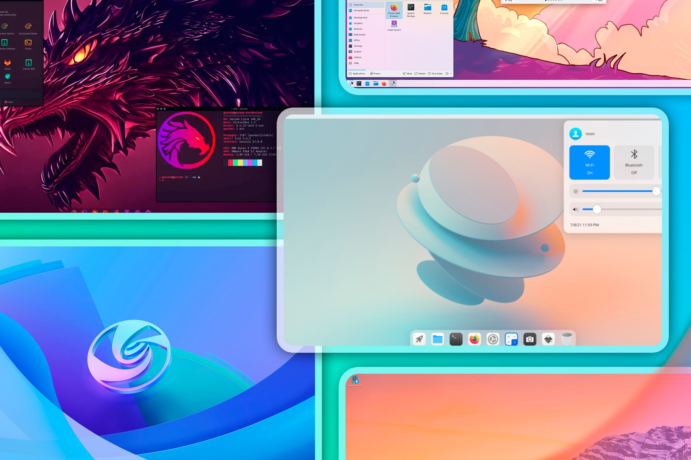
When it comes to Linux, functionality often takes center stage. However, as a long-time Linux user, I can tell you that Linux can be a real looker. So, if you want to spice up your Linux machine, here are my top five picks for the most beautiful Linux operating systems or distros.
1 Garuda Linux: Neon Colors and Cyberpunk Vibes
I’m a little biased about this one. I personally daily-drive Garuda Linux , so, of course, I think it looks good. But tell me you aren’t also blown away by its bold, neon-infused interface.
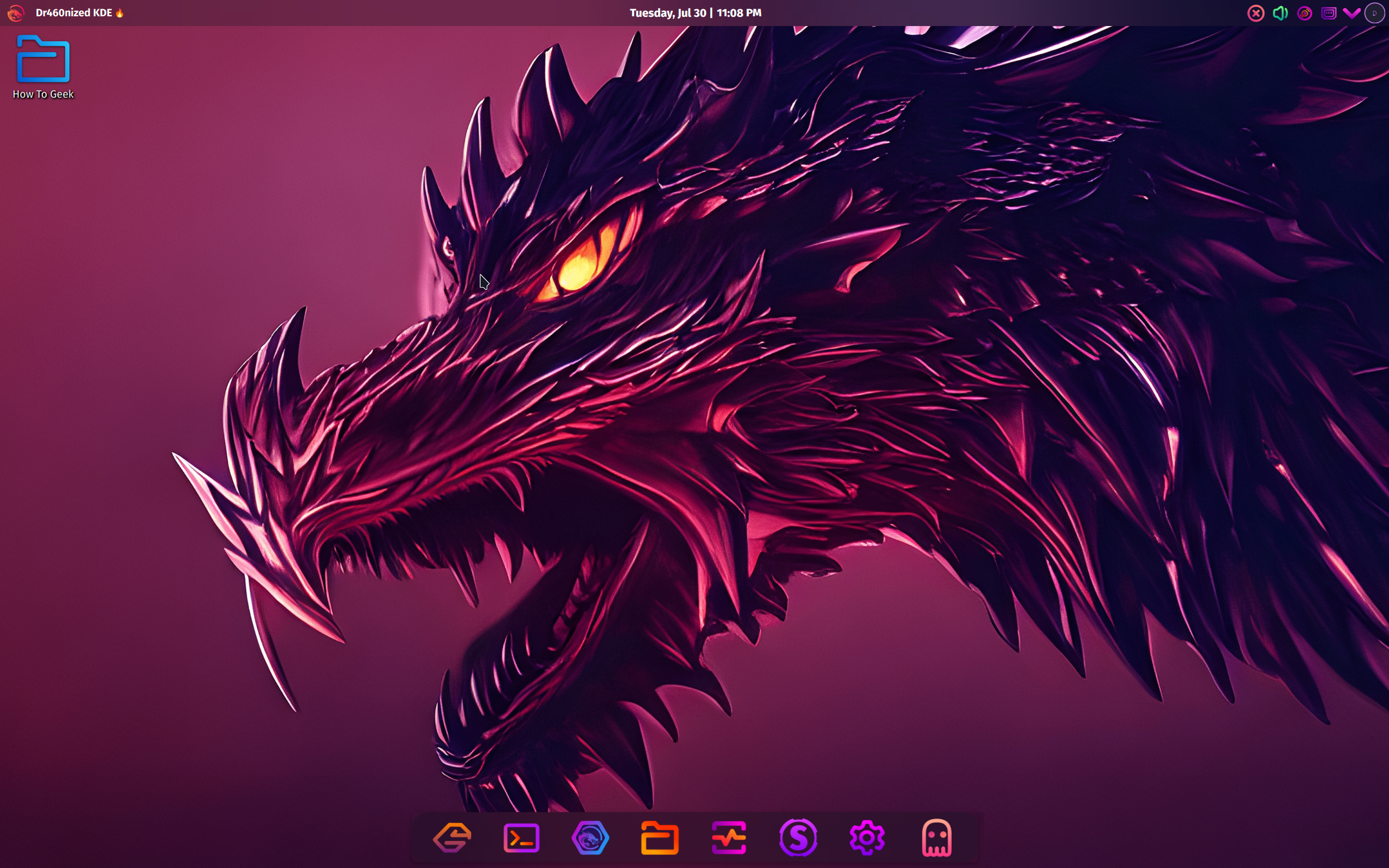
Garuda certainly is unapologetic in its embrace of cyberpunk aesthetics. The dark theme paired with neon colors is dominant across the operating system. As a result, you get a distinct gamer vibe from the distro.
The overall interface is also extremely well-polished. You’ll find really cool animation everywhere. For example, when you move a window, it’ll wobble. When you minimize an application, it shrinks into the icon tray at the bottom. There’s also a lot of transparency happening through the distro, especially across all the system apps.
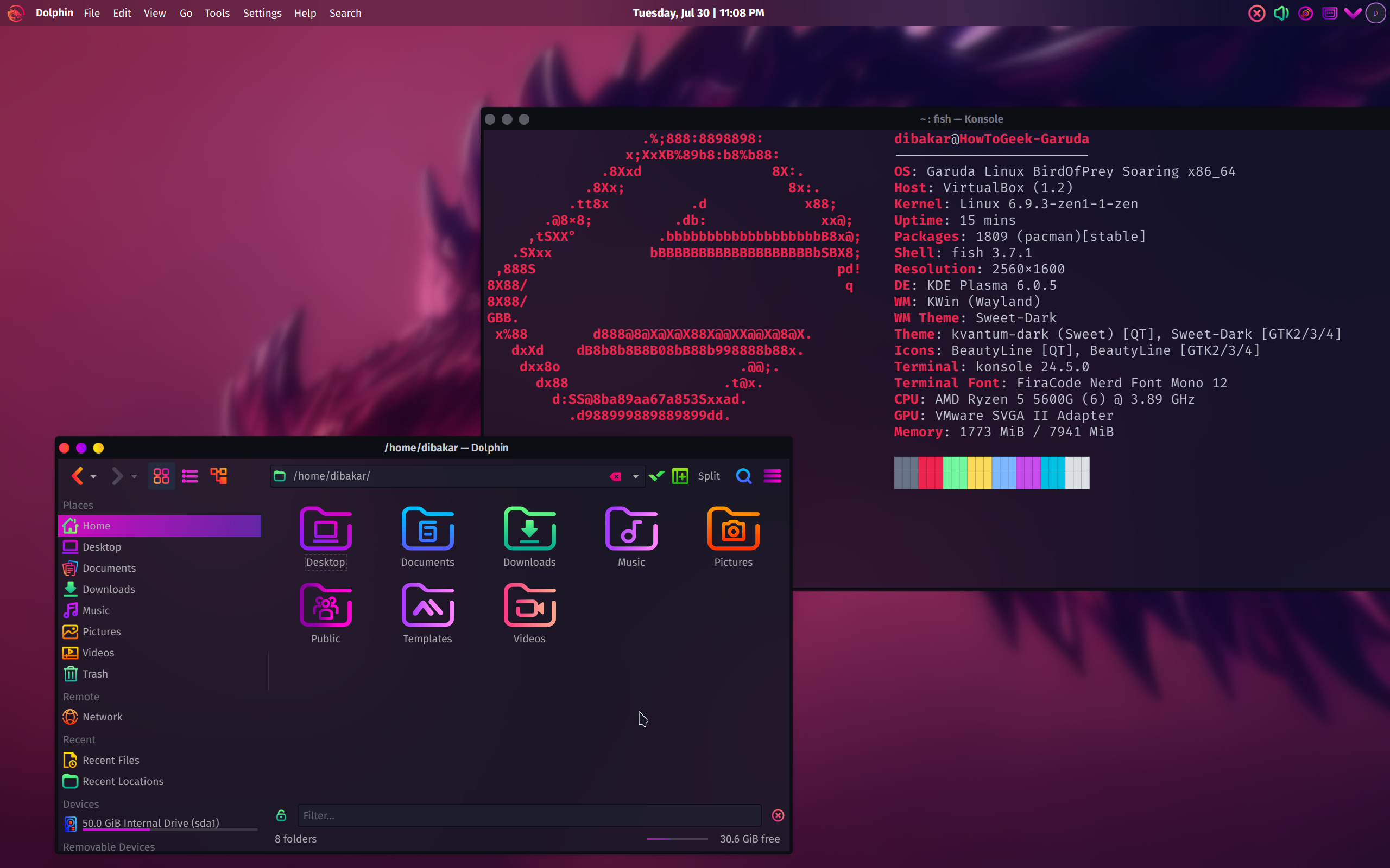
It’s these little touches that make Garuda feel alive and stand out as a one of a kind Linux distro. That said, all of this is made possible thanks to KDE Plasma . KDE Plasma gives you unparalleled customization options, so you can tweak almost every aspect of your operating system.
For example, if you’ve used Plasma before, you know that it offers a Windows-esque layout by default. However, the Garuda team has heavily modified it to look and feel more like macOS. You have the Dock at the bottom, and a menu bar at the top that populates with different menus based on the active app.
Also, it’s worth mentioning that Garuda’s theming extends to both Qt apps and GTK apps. Without getting too technical, this means that almost all third-party apps that you install on Garuda will adhere to the design settings, giving you a cohesive look across the operating system.
2 Deepin: The Right Amount of Class and Glass
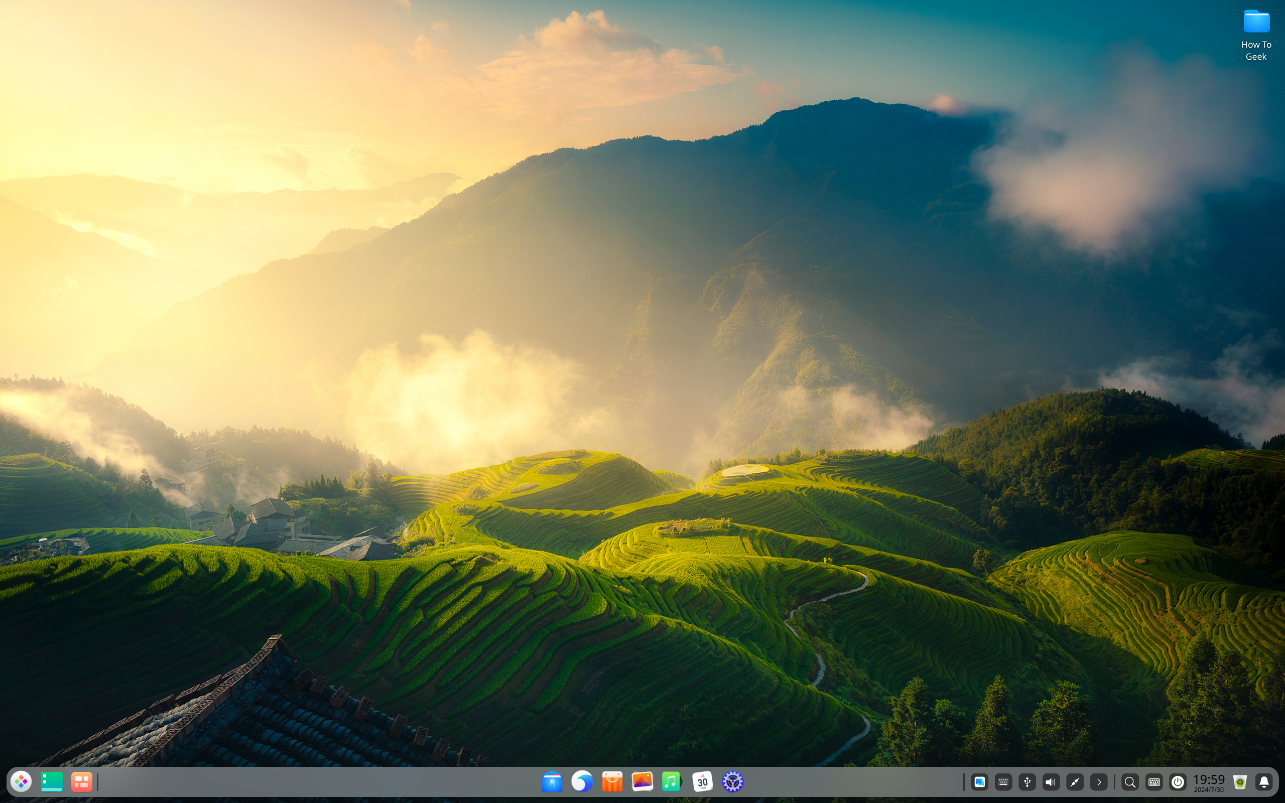
The jump to Deepin right after gazing at Garuda can be jarring. But looking at both side by side can help you get an idea of the design range and what’s possible on Linux.
Now, my personal experience with Deepin is limited to a virtual machine. However, I really loved my time with the distro, so much so that I had to ensure more people knew about it.
Deepin follows a more classy design style with a sleek and polished design language. It’s perfect for office environments and any other professional setting. That said, you are free to use it in personal setups as well if you like your desktop to have a clean and modern vibe.
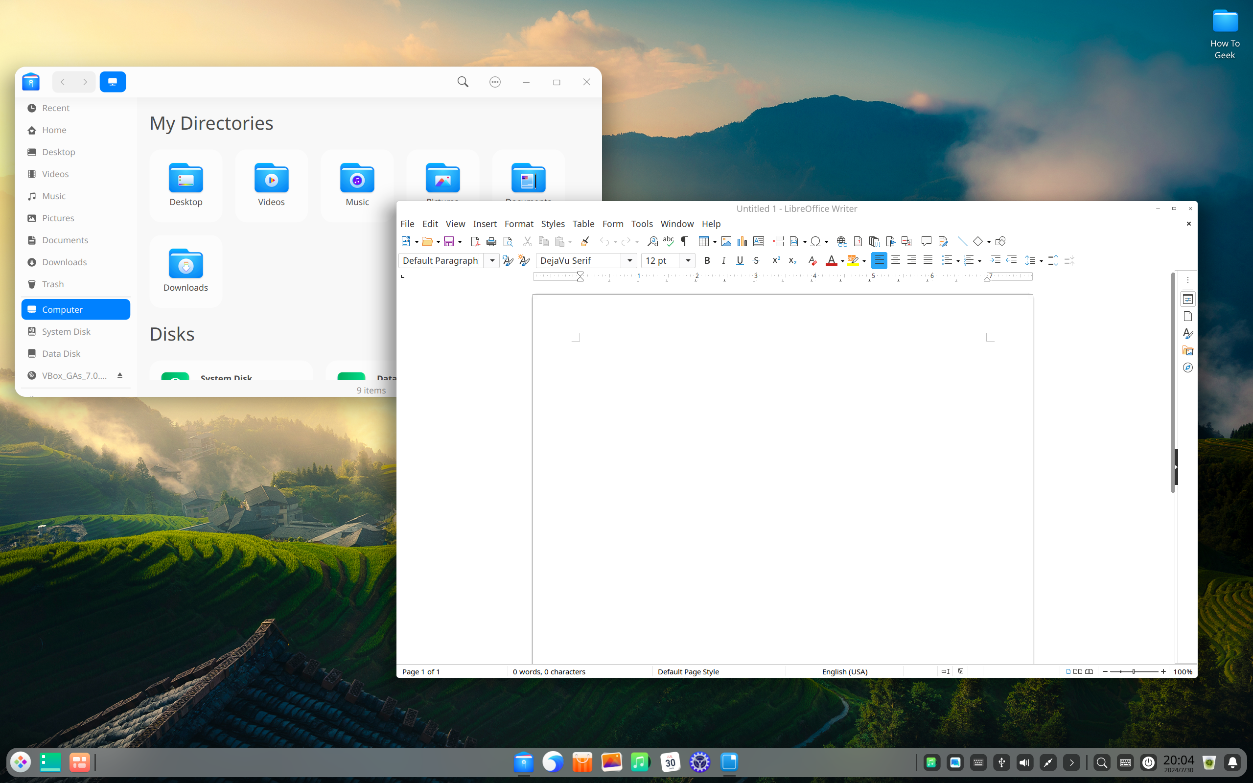
With Deepin, Glass is the name of the game. The entire UI looks like sheets of glass hovering in virtual space. I personally feel like it’s a more modern take on the classic Aero Theme of Windows 7. There are also subtle animations everywhere, from opening apps to closing them and navigating the overall UI.
Close
The unique user experience comes from Deepin’s own desktop environment, aptly named Deepin Desktop Environment (DDE) . It comes bundled with its own collection of apps for web browsers, file managers, music player, calculators, and more. This ensures a consistent UI across all your applications.
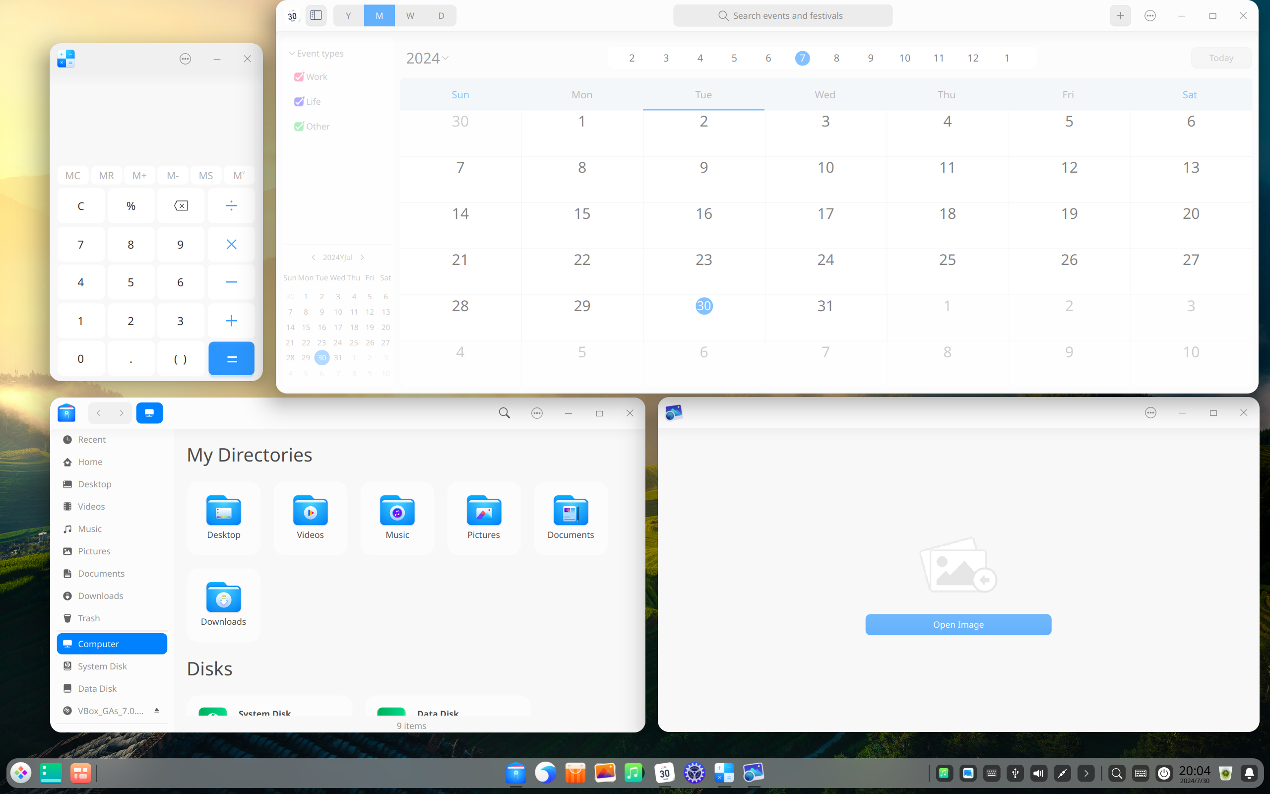
That said, when using third-party applications, I didn’t notice too much of an issue with design consistency. The main problem was the title bar of each third-party app appearing a bit thinner compared to the system apps, but that’s about it. If you aren’t actively looking for it, you won’t notice a thing.
Deepin Linux was caught up in a controversy back in 2018. The Deepin store used CNZZ tracking, which is a popular internet statistics provider in China, similar to Google Analytics. Deepin promptly responded to this and the CNZZ tracker was removed . At the time of writing, there are no active complaints or controversies surrounding Deepin.
3 Zorin OS: Modern, Polished, and Professional
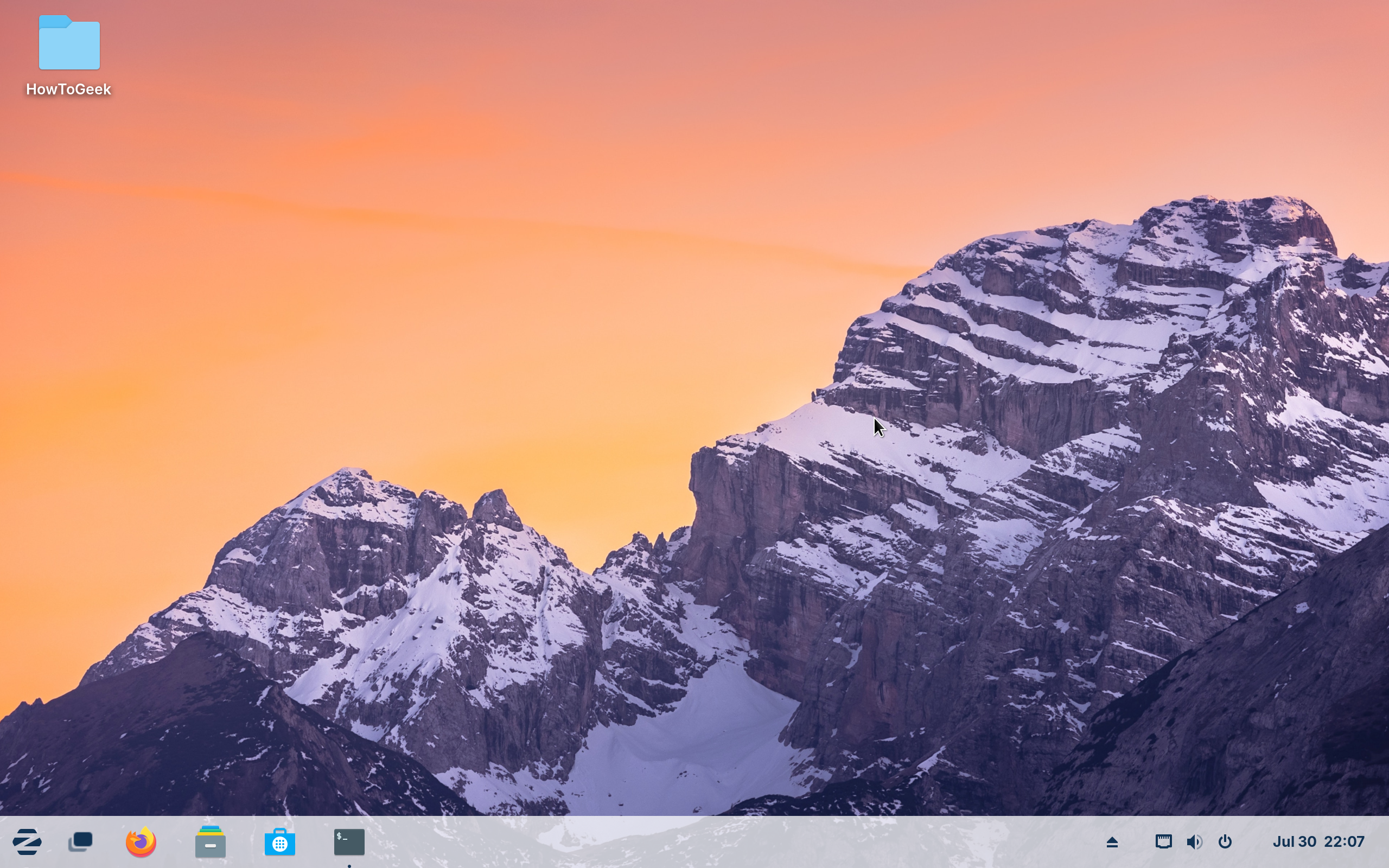
Zorin OS is my go-to recommendation for users looking for a Windows-like experience. Based on Ubuntu, Zorin uses a heavily customized version of GNOME 43. What you end up with is a stable and reliable operating system with a sleek and modern interface that looks both fresh and familiar.
That said, one of the main highlights of Zorin OS is its flexibility—or, more accurately, access to multiple layout styles. With the Zorin Appearance app, you can switch between different layout styles. By default, Zorin follows the Windows 7 layout, but you can tweak it to look more like Windows XP with the iconic taskbar app list or the newer GNOME Shell.
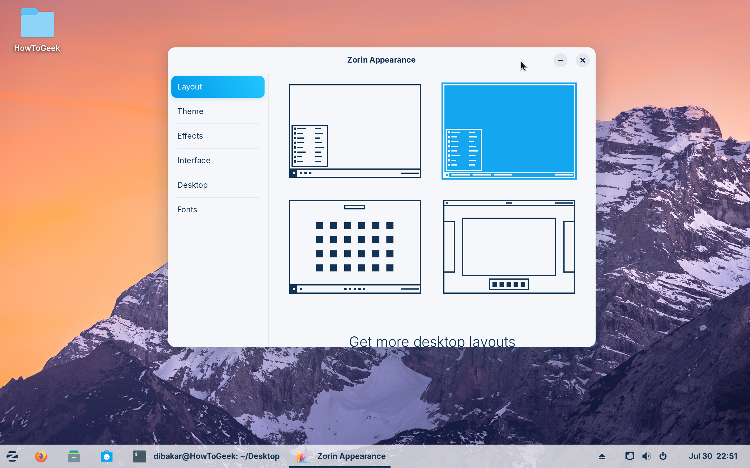
You can also upgrade to a paid version called Zorin OS Pro which brings even more design layouts, including the newer Windows 11 and macOS. This is paired with a lot more productivity apps and professional software.
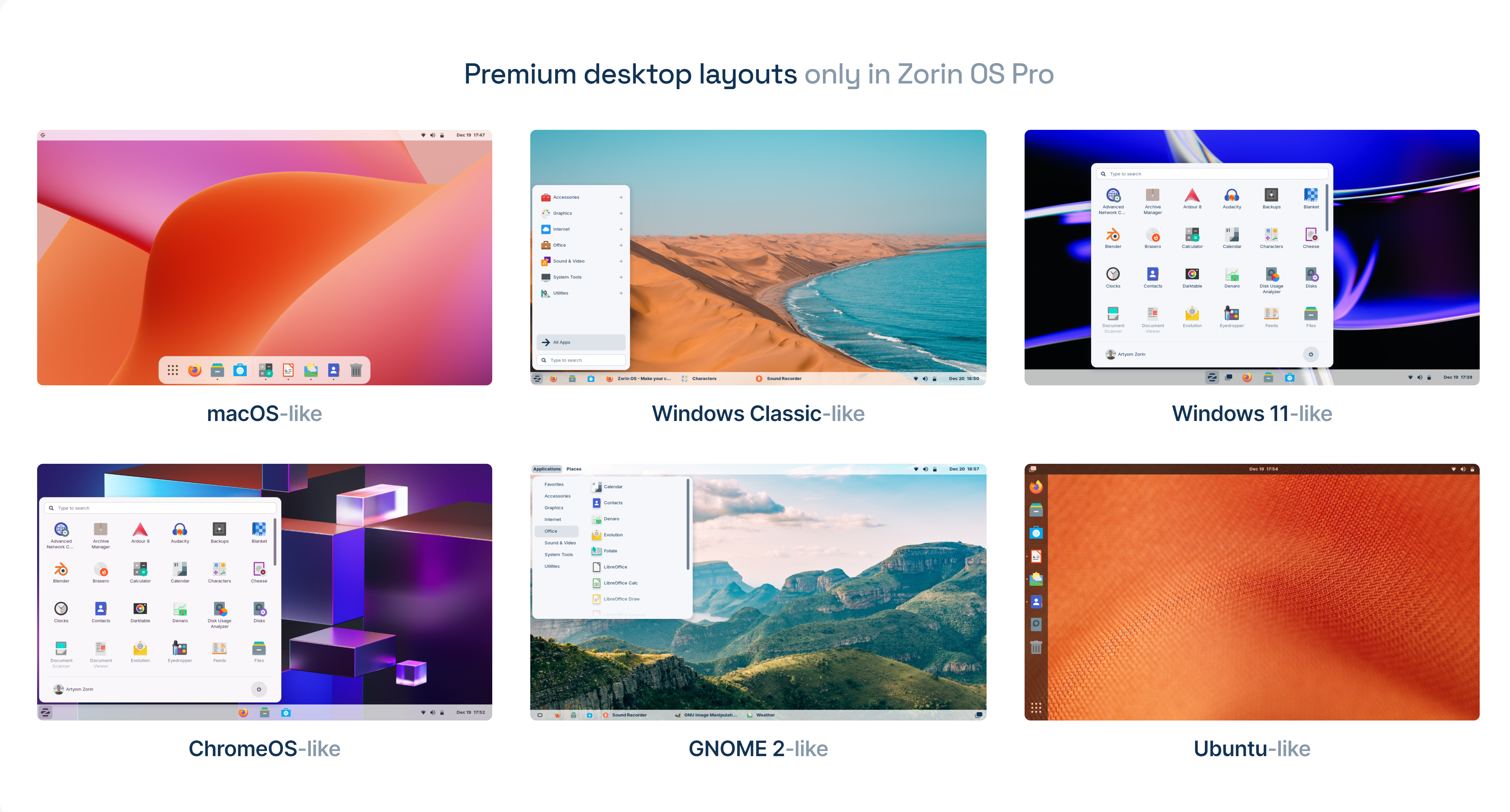
That said, the overall design stays consistent across all the layout styles. Zorin opts for a clean and professional aesthetic similar to Deepin but takes a more minimalist approach. I personally feel the design is more akin to Chrome OS, with a touch of translucency across the user interface.
Coming to performance, I have zero complaints. As I said, I recommend Zorin to all my friends looking for a Windows-like Linux experience. One of them has been running Zorin for the past three months now and has experienced zero hiccups. Albeit, they just use their PC to browse the internet.
4 KDE Neon: Clean, Airy, and Vibrant
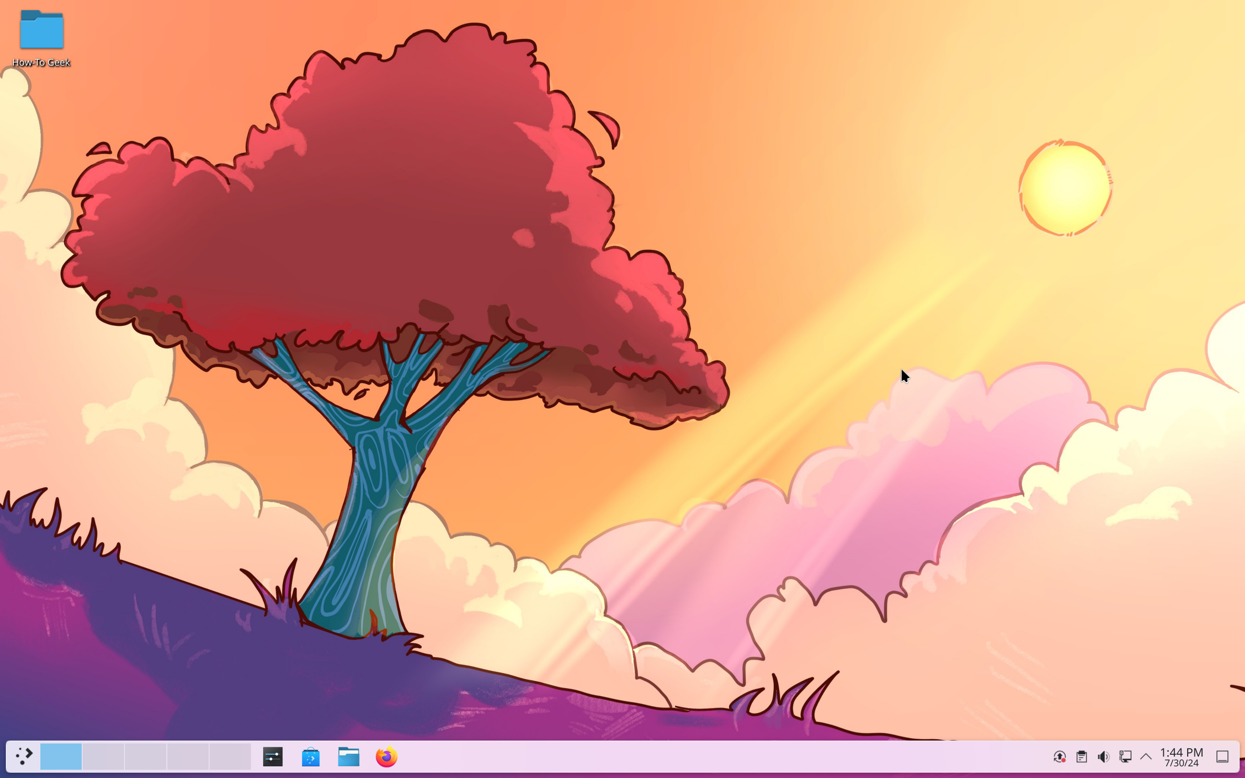
KDE Neon is the flagship Linux distribution for experiencing KDE Plasma with all the latest and greatest features straight out of the box. Now, KDE Plasma has always been my favorite desktop environment (DE) but I have never, till recently, championed KDE Neon. This is because I never liked the default look of Plasma and always tweaked it to suit my likings—that is, until Plasma 6 came into the picture.
Before, KDE Plasma was a powerhouse when it came to features and customizability. However, it lacked polish and design cohesiveness. The UI elements didn’t look consistent across the operating system. The biggest problem I had was the fonts looking thinner on the taskbar and bolder inside the apps.
Thankfully, Plasma 6 brings a much-needed design overall. The entire desktop looks extremely polished and professional. The default theming offers a clean and vibrant user interface that just feels airy and spacious. I love it so much that I have set up a KDE Activity (a dedicated workspace) on my Garuda system with the default KDE Plasma 6 look.
Close
So, KDE Plasma 6 looks cool. Great! Why not just use any other distro with Plasma 6 as the default DE? Well, that’s because almost all the distros that support KDE Plasma are arch-based. Arch-based distros are geared toward more advanced users. KDE Neon, on the other hand, is based on Ubuntu, making it much more user-friendly and stable. Kubuntu is also an option, but at the time of writing, it doesn’t ship with Plasma 6.
5 Manjaro: Flat and Modern Design With an Iconic Green Color Scheme
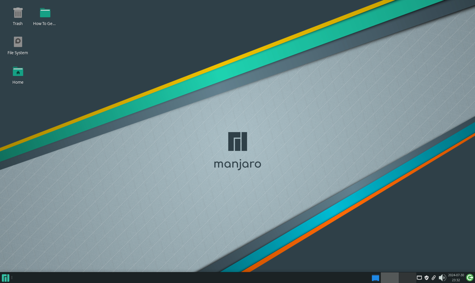
Last but not least, we have Manjaro Linux . Now, picking this one was a bit tricky because Manjaro gives you the option to choose between multiple desktop environments. Each desktop environment will offer a slightly different layout and user interface.
However, I want to spotlight the Manjaro XFCE edition since that’s the version I’ve personally used and loved a lot. Now, the thing about XFCE is that it’s not known for its looks. Don’t get me wrong, XFCE is a rock solid desktop environment with a lot of useful features and an extremely lightweight build. But it never stood out to me as a particularly good-looking desktop environment. That is, until I used it on Manjaro.
Close
Manjaro has a signature design style that you’ll find in all its different editions. It follows a flat and polished look, with sharp square windows and UI elements. To top it all off, you have the sleek green color scheme that is as iconic as Ubuntu orange. As an overall package, Manjaro looks clean, modern, and professional.
Also, it’s not just about the looks, as Manjaro is an excellent Linux distro for daily driving. Much like Garuda, it’s also arch-based, but it’s one of the more user-friendly arch-based distros. If you know the basics of Linux and feel comfortable with minor troubleshooting by yourself , you can take Manjaro out for a spin.
As you can see, Linux has a lot of different flavors and styles. From neon-drenched cyberpunk and gamer-y aesthetics to sleek and modern design layouts, there’s something for everybody.
Personally, I’m a huge advocate of using Linux distros that look the best to you. If you like how it looks, you’ll enjoy spending more time with it, which will teach you more about how it works, and you’ll become better at using it.
So pick a distro that you like, and take it out for a spin. If you aren’t ready to install it on bare metal just yet, try a virtual machine . Get to know how it performs and if you can do your daily work. And most importantly, have fun!
Also read:
- [New] Optimizing Your Music Library Transitioning From Spotify To YouTube Music
- [Updated] 2024 Approved Direct From Spotify to YouTube Best Apps for Streaming Conversions
- 2024 Approved Educational History Series - The Most Engaging Ones
- 完全なプロセス:Windows 11でスライドショーを一から作る方法
- Comprehensive Guide to Perfecting FaceTime Call Screen Captures for 2024
- Expert Tips on Immediate Termination of Faulty Windows Software Using Revo Uninstaller
- OpenAI Enables Speech Capabilities in ChatGPT for Interactive Responses
- PC製DVDの再生に失敗するDVDプレイヤー対策:原因と解決策
- Pioneering Protection Paradigms: Anticipating Top 7 Predictions
- Tailoring Essays with AI Assistance: GPT Methods
- The Potential Shifts in Web Development Through AI Enhanced Search Engine Technology
- Title: Top 5 Stunningly Elegant GNU/Linux Distributions
- Author: Larry
- Created at : 2024-12-20 16:48:21
- Updated at : 2024-12-28 00:44:39
- Link: https://tech-hub.techidaily.com/top-5-stunningly-elegant-gnulinux-distributions/
- License: This work is licensed under CC BY-NC-SA 4.0.